
Web Dashboard · Retail
Retail Video Analytics Dashboard
For a leading telecommunication company

Scope
3-month client project (with 1 month design focus stage)
2022 - 2023
Team
Product Manager x1
UI/UX Designer x1
Developer x1
My Role
UX/UI Designer
Overview
Background
Catering to a leading Hong Kong telecommunications firm, this project revolved around developing a Retail Video Analytics Dashboard. Aimed at enhancing shopper experiences and operational efficiencies across 30+ branches, the dashboard leveraged IoT and real-time camera data to inform traffic patterns, floor plans, and personalised promotions. Designed to serve multiple stakeholders, it offered comprehensive insights into shopper behavior and store performance.
Project Goal
Our main goal was to create a user-friendly dashboard translating complex data into actionable insights for stakeholders across the telecommunications company. It aimed to facilitate informed business decisions by offering real-time and historical shopper behaviour data. This would improve personalised shopping experiences, optimise traffic flow in stores, enhance outlet management, and identify loyal customers for tailored promotions and services.
Empathise
Given a demanding design schedule, I immediately immersed myself in the project by delving into the required dataset for visualisation.
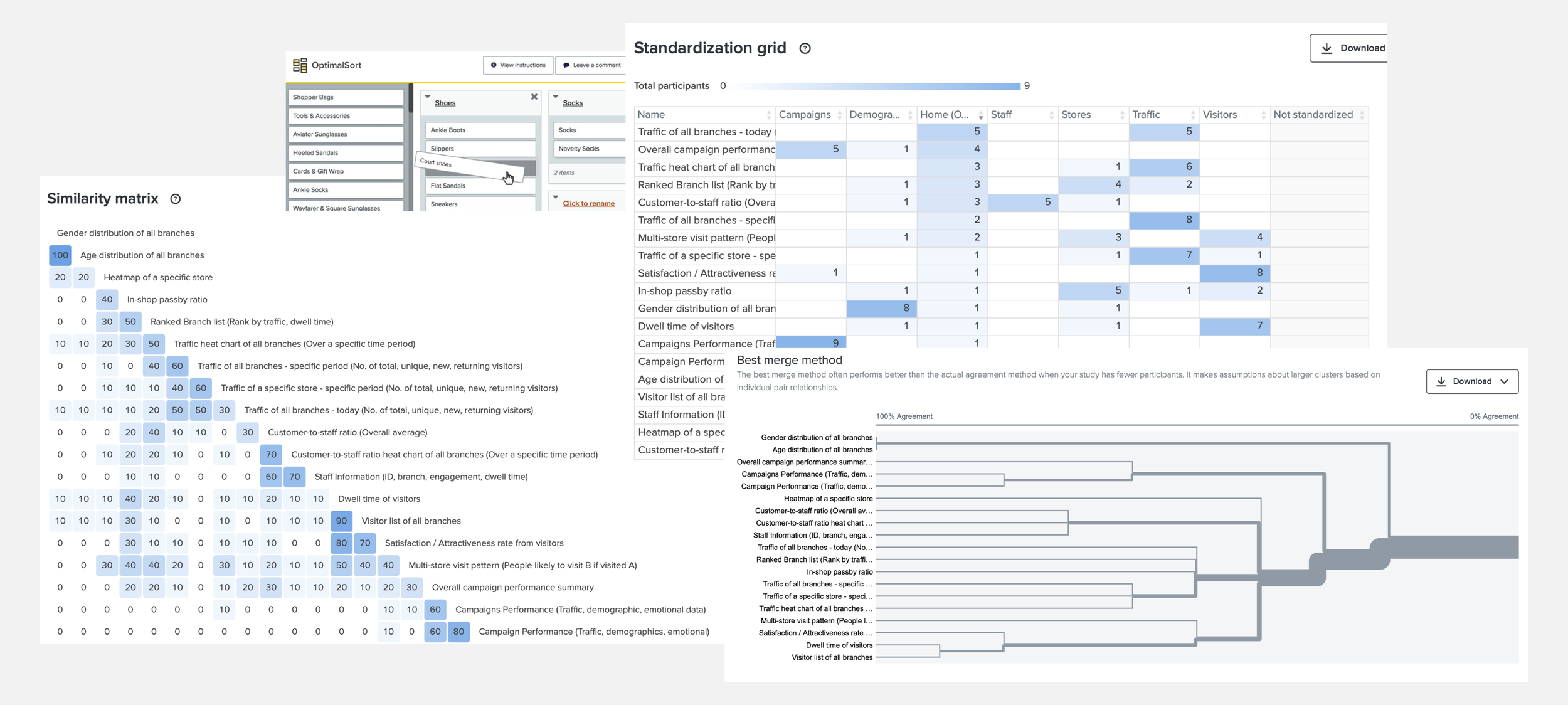
Card Sorting
To organise extensive statistics and desired data visualisations, I conducted unmoderated hybrid card sorting sessions with the client's staff. This structured an intuitive Information Architecture that ensure real users can find out desired data easily, revealing three main categories—visitor, staff, and overall traffic data—that guided our site's design.

Sitemap
Developing the sitemap based on gathered requirements and card sorting results, I visualised the site's structure and aligned it with developer feasibility, ensuring a preliminary design confirmation.
Ideate

Wireframe
Once the sitemap was approved, we crafted wireframes to conceptualise data visualisation ideas. These iterations ensured alignment with client expectations and functional needs.
Rapid Usability Testing
To validate the wireframes, I conducted rapid usability testing by recruiting four participants from key business departments. Each participant was assigned four information-finding tasks using the dashboard wireframe. Gathering their feedback and suggestions, we iteratively adjusted the sitemap and updated the wireframe several times until reaching a final version that met the client's agreement.
Summary of usability testing findings and suggestions include:
Add store selection for metrics under visitors page.
Introduce Visitor Dwell time and information about the number of visitors in different dwell time ranges (<2 mins / 2-5 mins / >30mins).
Modify the placement of average CTS data to a less prominent position.
Include a traffic hover display on the CTS ratio chart with a link to the store page.

Mood Boards
I presented styles in different versions as mood boards. The client chose the most favored style, which was integrated into the final design.
Design

Protoypes
The dashboard displayed both overall analytics and individual store views. It depicted various data, such as traffic and customer insights, using diverse visualisation methods (bar charts, graphs, heatmaps, etc.), aligning with client preferences and research insights.
-
![Design System Example 1]()
Design System Example
-
![Design System Example 1]()


Design System
Aligned with the design guidelines, the web dashboard incorporated interactions and styles that reflected professionalism and clarity. A robust design system was established, serving as a guide and repository for future design iterations and development.
Results & Iterations:
We conducted rigorous usability testing with internal business users to refine the design. Initially, the dashboard struggled with intuitive navigation and offering a comprehensive overview.
Post-iterations, the interface became more intuitive, enhancing user interactions and improving data interpretation efficiency. This iterative process continually enhanced the dashboard's usability, ensuring a seamless user experience.
Next project >>
Medical Service Booking &
Membership App